Lab

This section is dedicated to the collection of work-in-progress typefaces that I have been experimenting on for the last two years. Test around by typing a nice few words here and there, adjusting alignment and other options (through sliders or number input) and feel free to download for usage.

QG Scotsman

Version: 0.15

Last Updated: April 2026


Style: Humanist/Geometric

Total Glyphs: 421

Language Support: English, Vietnamese

Read full case study here

Showcased on Type Không (TDK0)

QG Scotsman is an indirect revival of Gill Sans — my interpretation of this iconic typeface in a modern context. It references the original 1928 specimen rather than Monotype's official digital revival of 2015, with a more geometric, monoline touch. Designed for both display and occasional body text use, the typeface includes OpenType features for added functionality and personality.

The name is a tribute to The Flying Scotsman — the world's most famous steam locomotive and the crowning achievement of the LNER — and by extension, to the deep connection between Gill Sans and British railway history. It was the LNER that first adopted Gill Sans as its standard typeface in 1929, applying it across locomotive nameplates, station signage, timetables, and posters; a legacy that cemented Gill Sans as one of the most recognisable typefaces in British visual culture.

The latest version (April 2026) includes redrawn glyphs for certain characters, alongside optical and kerning refinements, additional symbols and numerals (small figures and fractions) and an extensive set of ligatures.

Upcoming updates: new weights, more symbols and decorative ornaments.

QG Scotsman
HEIGHT
SIZE
ALIGN
Locomotive Train
QG Scotsman
HEIGHT
SIZE
ALIGN
Locomotive Train
QG Scotsman
HEIGHT
SIZE
ALIGN
Locomotive Train
QG Scotsman
HEIGHT
SIZE
ALIGN
The Flying Scotsman embodies the pinnacle of luxury train travel, offering passengers a journey steeped in elegance and mystique. Elegant carriages, impeccable service and breathtaking scenery combine to create an atmosphere of refined indulgence. Passengers revel in the golden age of rail travel, embracing romance and adventure with every passing mile.
The thrilling adventure of train travel entices tourists worldwide. Aesthetic railway stations and tranquil journeys through picturesque landscapes offer a unique experience. Timeless elegance and traditional charm blend seamlessly with cutting-edge technology. Travelers traverse vast distances in comfort, while tutelage from knowledgeable guides enhances the journey. Trundling along scenic routes, passengers can truly immerse themselves in the romance of rail.
Flamboyant railway enthusiasts find fulfillment in flourishing train journeys. Efficient and fleet, trains offer a finely-tuned travel experience. Flitting through picturesque landscapes, passengers can flaunt their affinity for this classic mode of transport. From first-class carriages to no-frills options, railways cater to diverse preferences. Affluent travelers may opt for plush accommodations, while budget-conscious adventurers might prefer more affordable alternatives.
QG Scotsman
HEIGHT
SIZE
ALIGN
The Flying Scotsman embodies the pinnacle of luxury train travel, offering passengers a journey steeped in elegance and mystique. Elegant carriages, impeccable service and breathtaking scenery combine to create an atmosphere of refined indulgence. Passengers revel in the golden age of rail travel, embracing romance and adventure with every passing mile.
The thrilling adventure of train travel entices tourists worldwide. Aesthetic railway stations and tranquil journeys through picturesque landscapes offer a unique experience. Timeless elegance and traditional charm blend seamlessly with cutting-edge technology. Travelers traverse vast distances in comfort, while tutelage from knowledgeable guides enhances the journey. Trundling along scenic routes, passengers can truly immerse themselves in the romance of rail.
Flamboyant railway enthusiasts find fulfillment in flourishing train journeys. Efficient and fleet, trains offer a finely-tuned travel experience. Flitting through picturesque landscapes, passengers can flaunt their affinity for this classic mode of transport. From first-class carriages to no-frills options, railways cater to diverse preferences. Affluent travelers may opt for plush accommodations, while budget-conscious adventurers might prefer more affordable alternatives.

Venimeux Variable

Version: 0.1

Last Updated: May 2025


Style: All-caps Serif Display

Total Glyphs: 118

Language Support: English, Vietnamese

Read full case study here

QG Venimeux ("venomous" in French) Variable is an ongoing typographic exploration building on QG Venimeux Display — a revival type of a seemingly lost typeface found on the book cover of Animaux Venimeux et Venins, held in the Vietnam National University Archives.

Inspired by the diverse bioecology of Australia, and the relationships between different animals in the food chain, this variable version offers four distinctive styles that are closely related but also have unique characteristics on their own. This is expressed through two values: "Danger Level" (serif sharpness and contrast level, from level 0 to 20) and Width (from level 0 to 10), which can be customised via OpenType features.

The diferent styles and width options are categorised and named as such:

Small Prey — Transitional/Semi-condensed

Large Prey — Transitional/Extended

Small Predator — Didone/Semi-condensed

Large Predator — Didone/Extended

Upcoming updates: bezier interpolation refinement, lowercase glyphs (probably), and basic punctuation and numerals.

VENIMEUX VARIABLE SMALL PREY>
HEIGHT
DANGER LEVEL
SIZE
WIDTH
ALIGN
Preys VS. Predators
VENIMEUX VARIABLE SMALL PREY>
HEIGHT
DANGER LEVEL
SIZE
WIDTH
ALIGN
Preys VS. Predators
VENIMEUX VARIABLE SMALL PREY>
HEIGHT
DANGER LEVEL
SIZE
WIDTH
ALIGN
Preys VS. Predators
VENIMEUX VARIABLE SMALL PREY>
HEIGHT
DANGER LEVEL
SIZE
WIDTH
ALIGN
AUSTRALIA IS RENOWNED FOR ITS DIVERSE AND ABUNDANT VENOMOUS ANIMAL LIFE, ENCOMPASSING A WIDE ARRAY OF SNAKES, SPIDERS, MARINE ANIMALS, AND INSECTS. THESE ANIMALS HAVE EVOLVED UNIQUE VENOM COMPOSITIONS AND DELIVERY SYSTEMS, WHICH HAVE BEEN SHAPED BY THEIR SPECIFIC ECOLOGICAL NICHES AND EVOLUTIONARY HISTORIES.
THE LOSS OF TOP PREDATORS FROM REGIONS AROUND THE WORLD IS LEAVING MICROPREDATORS AS THE DOMINANT PREDATORS IN MANY ECOSYSTEMS. THE NEED TO UNDERSTAND AND CONSERVE THESE SPECIES AND THEIR ECOLOGICAL FUNCTIONS IS THEREFORE MORE VITAL THAN EVER.
MARSUPIALS ARE A DIVERSE GROUP OF MAMMALS CHARACTERISED BY HAVING A POUCH WHERE THEIR YOUNG DEVELOP AFTER BIRTH. UNLIKE OTHER MAMMALS, MARSUPIALS DO NOT DEVELOP A TRUE PLACENTA. THEY ARE PRIMARILY FOUND IN AUSTRALASIA, WALLACEA, AND THE AMERICAS.
VENIMEUX VARIABLE SMALL PREY>
HEIGHT
DANGER LEVEL
SIZE
WIDTH
ALIGN
AUSTRALIA IS RENOWNED FOR ITS DIVERSE AND ABUNDANT VENOMOUS ANIMAL LIFE, ENCOMPASSING A WIDE ARRAY OF SNAKES, SPIDERS, MARINE ANIMALS, AND INSECTS. THESE ANIMALS HAVE EVOLVED UNIQUE VENOM COMPOSITIONS AND DELIVERY SYSTEMS, WHICH HAVE BEEN SHAPED BY THEIR SPECIFIC ECOLOGICAL NICHES AND EVOLUTIONARY HISTORIES.
THE LOSS OF TOP PREDATORS FROM REGIONS AROUND THE WORLD IS LEAVING MICROPREDATORS AS THE DOMINANT PREDATORS IN MANY ECOSYSTEMS. THE NEED TO UNDERSTAND AND CONSERVE THESE SPECIES AND THEIR ECOLOGICAL FUNCTIONS IS THEREFORE MORE VITAL THAN EVER.
MARSUPIALS ARE A DIVERSE GROUP OF MAMMALS CHARACTERISED BY HAVING A POUCH WHERE THEIR YOUNG DEVELOP AFTER BIRTH. UNLIKE OTHER MAMMALS, MARSUPIALS DO NOT DEVELOP A TRUE PLACENTA. THEY ARE PRIMARILY FOUND IN AUSTRALASIA, WALLACEA, AND THE AMERICAS.

Princess Display

Version: 0.05

Last Updated: April 2025


Style: All-caps Slab Serif Display

Total Glyphs: 44

Language Support: English

View poster here

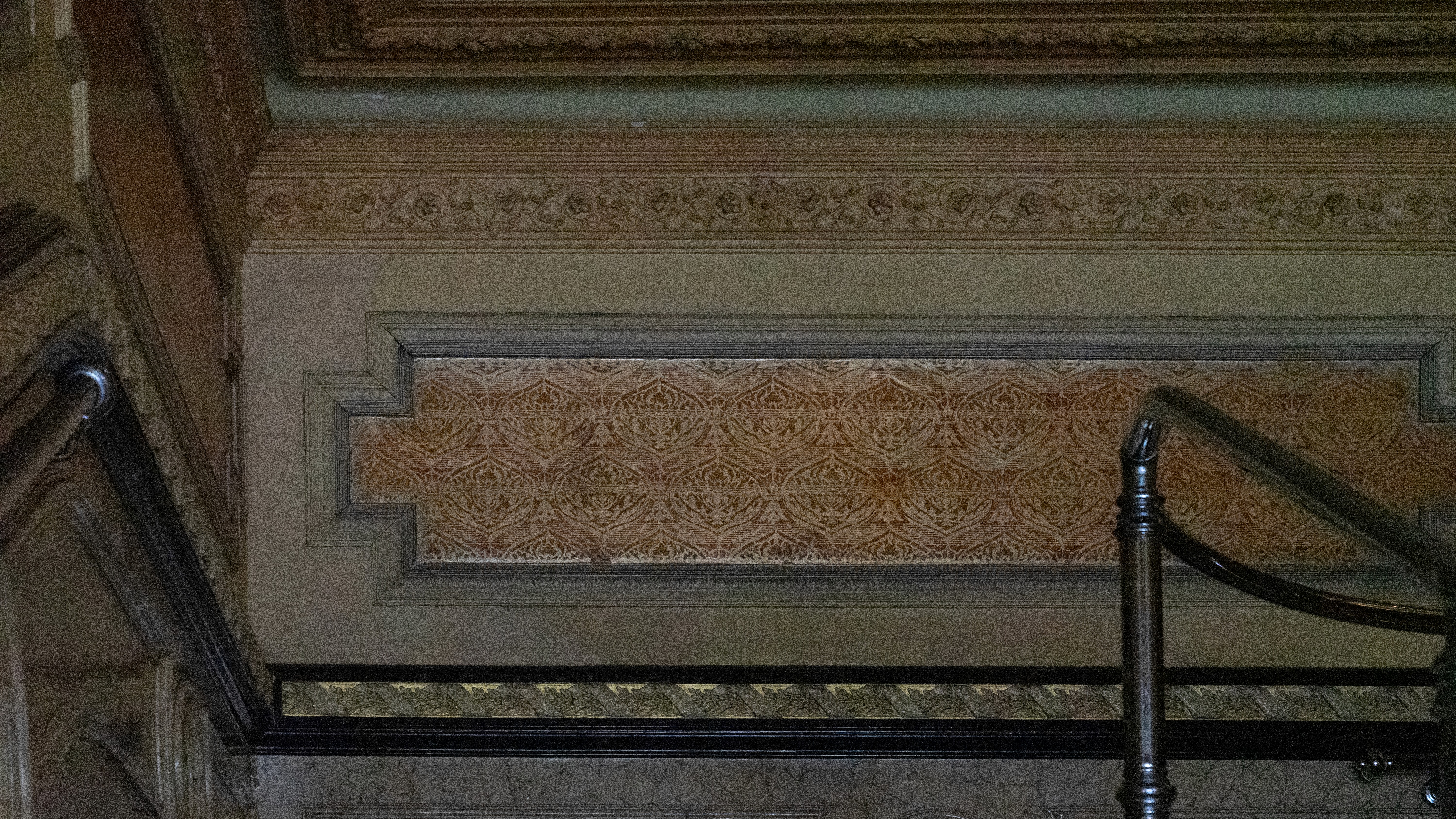
Princess Display is an experimental font created in the Experimental Typography Workshop (GRAP2682) course in RMIT University in 2025. The font's main structure is based on the 1920s vintage hand lettering signage of Princess Theatre in Melbourne CBD, located right next to the Parliament of Victoria, while some of the glyphs offer an alternate stylistic set, inspired by the architectural ornaments found in the building.

*The stylistic set is currently unavailable in the preview, please download the full font to experience

Princess Display
HEIGHT
SIZE
ALIGN
PRINCESS THEATRE
Princess Display
HEIGHT
SIZE
ALIGN
PRINCESS THEATRE
Princess Display
HEIGHT
SIZE
ALIGN
PRINCESS THEATRE

Quang Nguyễn

Communication Designer

is a Vietnamese design practitioner/illustrator currently based in Naarm (Melbourne), and an ongoing Master’s student of Communication Design at RMIT University. 


Previously held a Bachelor of Communication (Advertising) degree and throughout years of accumulated independent design learning and practice, Quang is currently focused on brand illustration, brand identity, and communication design, with some of past high-profile clients including Sovico Group, RMIT, and UNESCO. He also frequently collaborates with Hands Collective, an award-winning brand consultancy based in Hanoi, and produces works recognised and featured by Behance, Dieline, and Pentawards.

[GMT+7]

11:47:41

Hanoi, Vietnam

[GMT+4]

14:47:41

Naarm, Australia

As a Vietnamese currently residing and working on the stolen lands in the Kulin Nation, I acknowledge the Wurundjeri Woi-wurrung and Bunurong peoples as the Traditional Owners, and recognise their deep and ongoing connection to these lands and waters. I pay my respects to their Elders past, present, and emerging. Sovereignty has never been ceded. It always was and always will be, Aboriginal land.

© Quang Nguyễn, 2026