QG Scotsman
Personal Project
Year: 2024–current
Category: Type Design
Type Design: Quang Nguyễn
Technical Guidance/Support:
Quang Khải (Thecoa Foundry),
Lê Minh (Mẫu Type)

In late May 2024, I had an opportunity to participate in Type Không (TDK0), an Vietnamese online type design course hosted by Quang Khải (Thecoa Foundry) & Lê Minh (Mẫu Type). Focused on reviving old typefaces, the course covers basic type design principles across three months, from studying specimens and sketching to digitalising. Students are also encouraged to develop their own concepts and personal inputs.
As my interpretation of Gill Sans — one of the most iconic typefaces in history — in a modern context, QG Scotsman draws from the 1928 original specimen rather than Monotype's official digital revival of 2015. Set in medium weight and designed for both display and occasional body text use, the typeface is friendly and readable, with OpenType features integrated for added functionality and personality.
The typeface's name is taken from The Flying Scotsman — the world's most famous steam locomotive and the magnum opus of the London and North Eastern Railway (LNER), one of Gill Sans's first commercial clients — as a tribute to the railway industry that played a significant role in the original typeface's origin and history.

Specimen overview

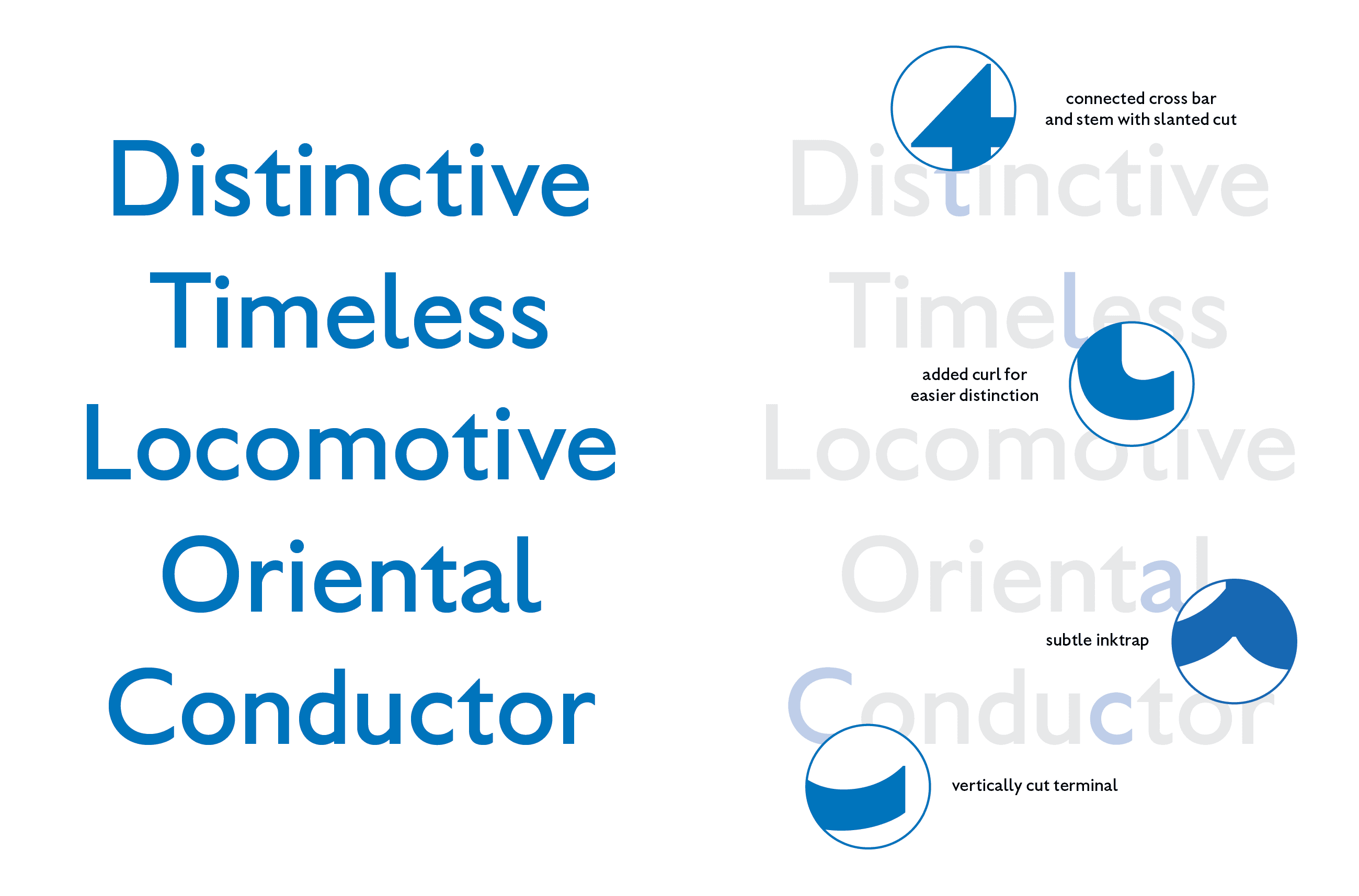
Main characteristics. While core features of the original typeface are retained, I decided to add certain updates such as the curl in the lowercase L (to easier distinction between it, uppercase I and number 1), and cutting angle in the terminals (for consistency)


One of the biggest features of QG Scotsman compared to Gill Sans is the addition of Vietnamese diacritics


Alternates, arrows and some fun ornaments. The uppercase Q alternate and the manicule are easter eggs from Eric Gill’s original sketch for Gill Sans (photo above), while the descending uppercase J refers to Stanley Morison’s initial proposal of the letter's design to Gill
A playful train carriage ornament glyph that lets users draw an infinite train (through OpenType)


Typeface in use (timetable, onboard dining menu, travel stamps and tickets to align with the chosen concept)
Quang Nguyễn
Communication Designer
is a Vietnamese design practitioner/illustrator currently based in Naarm (Melbourne), and an ongoing Master’s student of Communication Design at RMIT University.
Previously held a Bachelor of Communication (Advertising) degree and throughout years of accumulated independent design learning and practice, Quang is currently focused on brand illustration, brand identity, and communication design, with some of past high-profile clients including Sovico Group, RMIT, and UNESCO. He also frequently collaborates with Hands Collective, an award-winning brand consultancy based in Hanoi, and produces works recognised and featured by Behance, Dieline, and Pentawards.
[GMT+7]
Hanoi, Vietnam
[GMT+4]
Naarm, Australia
As a Vietnamese currently residing and working on the stolen lands in the Kulin Nation, I acknowledge the Wurundjeri Woi-wurrung and Bunurong peoples as the Traditional Owners, and recognise their deep and ongoing connection to these lands and waters. I pay my respects to their Elders past, present, and emerging. Sovereignty has never been ceded. It always was and always will be, Aboriginal land.