Letters to Letters
Masters Project
Year: 2025
Category: Publication Design
Editorial Design: Quang Nguyễn
Lecturer/Supervisor (RMIT University):
Kim Mumm Hansen
Writing: Quang Nguyễn, Aaron Kumar, Anna Winston, Beatrice Warde, Brad Haylock, Emma Goldberg, Hằng Phạm, Jamie xiao-ru Sun, Keith Robertson, Lubna AlMadani, Nahyun Park, Robin Kinross, Ryan Gerald Nelson, Sergio Ramírez Llamas, Shafa Rizkiya Raihan, Silvia (Xiangyi) Li, Yating Yu, Yijia Gao
Printing and Production: Little Print

Letters to Letters is a curated collection exploring typography's role in contemporary book design, centred on a longstanding debate: should type be invisible, serving content transparently, or can it be expressive and visible in its own right? Drawing on essays from professional designers and RMIT Master of Communication Design students, the book embraces the tension between restraint and experimentation rather than resolving it. Its experimental layout — alternating verso and recto pages, symmetrical and asymmetrical compositions — mirrors this philosophy. It offers an unconventional and disruptive reading flow, yet with a purpose: to invite readers to actively compare perspectives and discover that good typography may lie not in doctrine, but in knowing when each approach serves best.
Typefaces:
OT Jubilee by Off Type
Antonia Variable by Typejockeys
Paper stocks:
Cover: Envirocare 100% Recycled
Inner: Bulkynews Paper 80gsm

Book cover


From left to right: Table of Contents and Glossary page spreads
The first chapter — Types of Type — brings together conflicting ideologies and insider perspectives from leading typographers and designers — from the story behind the world's most hated font to 20th-century notions of "good" and "evil" typography. It challenges readers to question what constitutes good typography, how it should engage audiences, and when rules exist to be broken, ultimately asking whether absolute answers in typography and design can ever truly exist.

Book introduction and reading guide


Scanned page spreads in the first chapter: Type of Types
The second chapter — Letters to Letters — includes eleven essays by RMIT Master of Communication Design students. The collective writings examine typography across a diverse range of contemporary publications — from a cookbook designed for hungover readers to art exhibition catalogues. Each offers a distinct perspective on how typographic choices reflect designer intent, revealing how subject matter shapes design thinking and methodology. Together, they provide a window into contemporary editorial design while demonstrating that typography is always in conversation with its content.
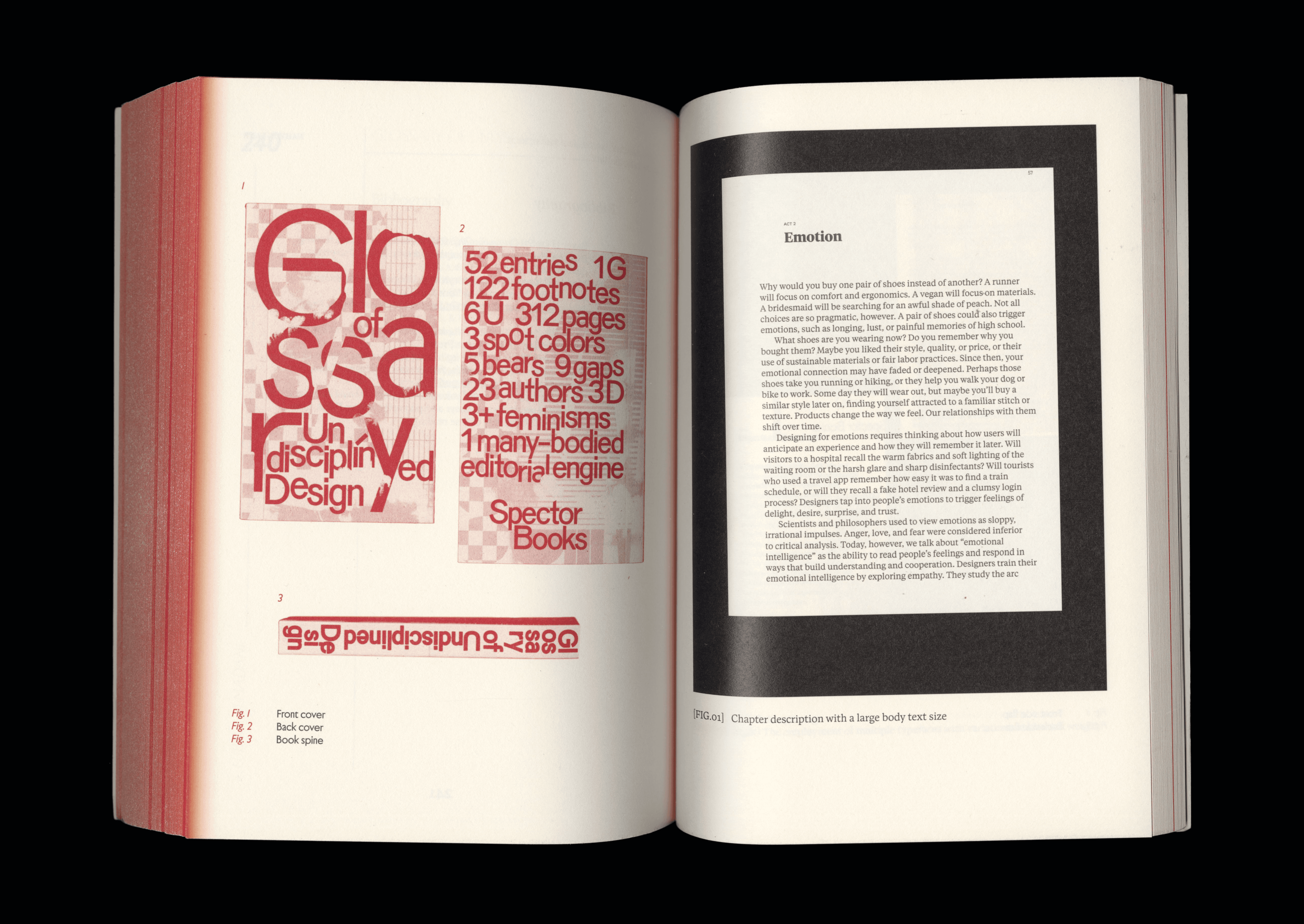


Scanned page spreads in the second chapter: Letters to Letters
Quang Nguyễn
Communication Designer
is a Vietnamese design practitioner/illustrator currently based in Naarm (Melbourne), and an ongoing Master’s student of Communication Design at RMIT University.
Previously held a Bachelor of Communication (Advertising) degree and throughout years of accumulated independent design learning and practice, Quang is currently focused on brand illustration, brand identity, and communication design, with some of past high-profile clients including Sovico Group, RMIT, and UNESCO. He also frequently collaborates with Hands Collective, an award-winning brand consultancy based in Hanoi, and produces works recognised and featured by Behance, Dieline, and Pentawards.
[GMT+7]
Hanoi, Vietnam
[GMT+4]
Naarm, Australia
As a Vietnamese currently residing and working on the stolen lands in the Kulin Nation, I acknowledge the Wurundjeri Woi-wurrung and Bunurong peoples as the Traditional Owners, and recognise their deep and ongoing connection to these lands and waters. I pay my respects to their Elders past, present, and emerging. Sovereignty has never been ceded. It always was and always will be, Aboriginal land.